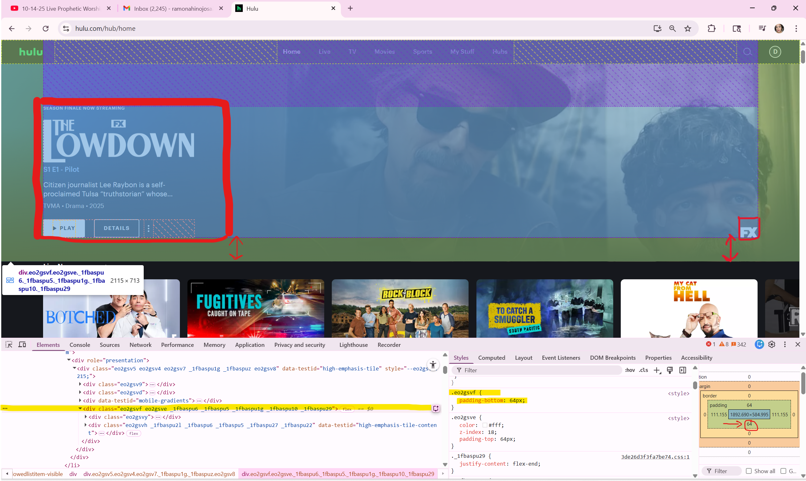
www.hulu.com/hub/home Links to an external site I chose is hulu.com. My website of choice per instructions, were to inspect and identify a specific element, describing how it utilizes the CSS Box Model, including padding, and how the site leverages Flexbox to achieve its layout. The first element I chose was the main preview area of tending movies/shows, which is the yellow-highlighted box ("div class="eo2gsvf eo2gsve _1fbaspu6 _1fbaspu5 _1fbaspu1g _1fbaspu10 _1fbaspu29"). Now, within the yellow area is a grayish-blue box containing the media information and the lower-right-hand corner logo; the padding is adjusted to 64px. This gives the media information and the logo in the right-hand corner space of 64px from the bottom of the yellow box.
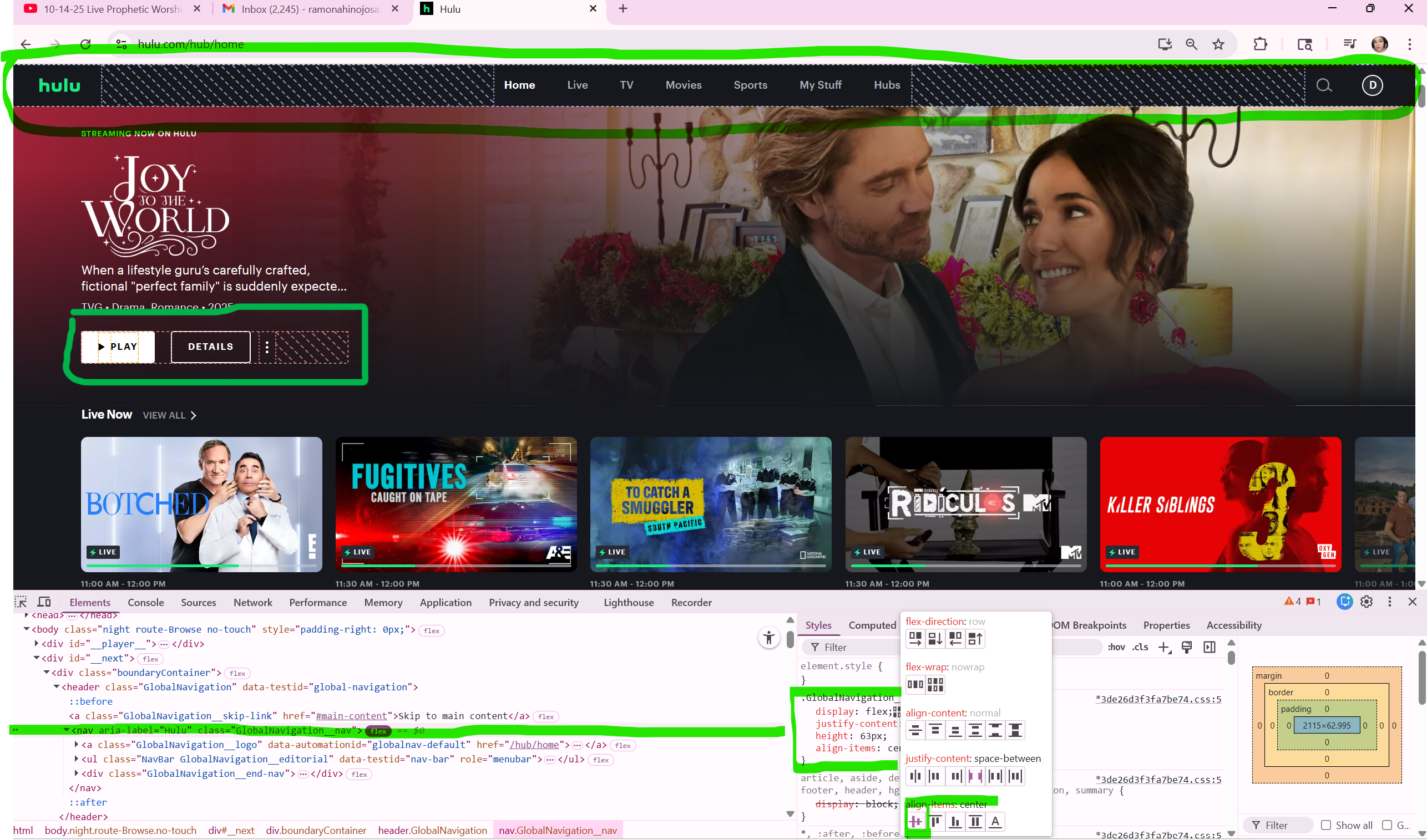
Hulu utilizes a combination of CSS properties, integrating both Flexbox and CSS Grid layout systems to create a dynamic and responsive user interface. The majority of this website utilizes the Flexbox "align-items" property to ensure vertical centering of elements within containers, like text next to an image in a media object style component. The highlighted sections in lime-green notation indicates that the text and elements are aligned center for better visibility to the audience.
https://www.hulu.com/hub/home
Back to Homepage